
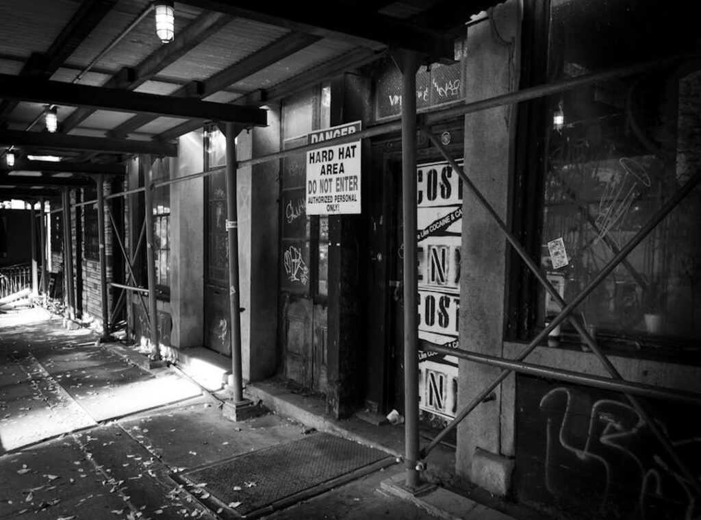
You want to move past those simple bubble letters, right? I get it, and you’re ready for something more.
Something that grabs attention and makes a statement. graffiti abeceda hard is where it’s at.
But how do you get there? It’s not as hard as you might think. Trust me, it’s all about learning the basics.
Structure, flow, and layering are the keys.
This guide will break it down step by step. No more guesswork, and no more feeling stuck.
Just clear, straightforward instructions to help you create your own unique, hard-style graffiti alphabet from scratch.
So, let’s dive in. Are you ready to level up your lettering?
What Makes a Graffiti Design ‘Hard’? Deconstructing the Core Elements
When people talk about a ‘hard’ graffiti design, they’re usually referring to Wildstyle. It’s the highly complex and abstract form of graffiti that can look like a chaotic mess to the untrained eye.
But there’s a method to the madness. Wildstyle is built on four fundamental components: the basic letter structure (the skeleton), connections (how letters interlock), extensions (arrows, bars, and flourishes), and flow (the overall rhythm of the piece).
The complexity in Wildstyle doesn’t come from making the initial letter unreadable. Instead, it’s all about layering these elements.
Think of a simple throw-up—a quick, basic tag. Now, imagine adding extensions and connections to it. You start with a legible, well-proportioned letterform and then build on it.
This is the most crucial takeaway.
Every complex design begins with a solid foundation. The graffiti abeceda hard you see isn’t just random; it’s a carefully crafted blend of these core elements.
So, next time you see a Wildstyle piece, take a closer look. You might just start to see the layers and the skill behind it.
Your First Complex Letter: A Step-by-Step Blueprint
Let’s dive into creating a single complex letter. We’ll use ‘S’ as our prime example because of its versatile shape.
Step 1: Start with a basic, bold block letter. This is the non-negotiable foundation or ‘skeleton’.
Step 2: Begin bending and warping the bars of the letter. Exaggerate curves and sharpen angles, but make sure the original letter is still recognizable.
Step 3: Add foundational extensions. Introduce one or two simple arrows or connecting bars that extend from the natural endpoints of the letter.
Step 4: Create depth with basic 3D block shading. Draw parallel lines from each corner and connect them to give the letter weight.
Practice this single-letter process multiple times to build muscle memory before attempting an entire alphabet.
Graffiti abeceda hard can be a great way to get inspired and see how others have transformed their letters.
Remember, the key is to start simple and gradually add complexity. Don’t rush it. Take your time, and you’ll see your skills improve.
Building a Cohesive Alphabet: From One Letter to a Full Set
Designing an alphabet is like building a team. You want all 26 letters to look like they belong together, not like a random group of strangers.
First things first, create some style rules. For example, “All vertical bars will have a sharp serif” or “All curves will end in a specific type of arrow.” These rules are your playbook. Stick to them.
Now, let’s talk about applying these rules. If you decide that all curves should end in a specific type of arrow, make sure that applies to both the O and the T. Consistency is key.
Uniform line weight is a big deal. Imagine if one letter was super bold and another was barely visible. It’d be like having a basketball player and a chess champion on the same team.
Not a good look.
Negative space matters too. Think of it as the breathing room between letters. If you mess this up, your alphabet will feel cramped and chaotic.
Start small, and practice with a short, 3-4 letter word. This way, you can test the cohesion of your style rules before committing to the full alphabet.
It’s like a trial run for your design.
Oh, and don’t forget to have fun with it! Designing an alphabet is a creative journey. Embrace the process and let your imagination run wild.
Just like how you might use resource management tips to dominate in zeromag, managing your design elements can help you dominate in your alphabet project.
Graffiti abeceda hard, anyone?
Advanced Techniques: Adding Depth, Flow, and Detail
Introducing advanced elements can elevate a design from good to great. It’s all about the small details that make a big impact.
- Strategically Add ‘Bits’ and ‘Chips’
- These are small, abstract shapes that fill negative space.
- They add a sense of explosive energy to your design.
Creating more complex 3D effects is another game-changer. Perspective blocks or beveled edges give letters a dynamic feel.
The keyline, or secondary outline, is crucial. It makes the entire piece pop from the background.
Intricate color schemes and fills (the patterns inside the letters) complement the letter structure. But here’s the thing—finding the right balance can be tricky.
Graffiti abeceda hard is a style that benefits from these techniques. Yet, it’s not always clear which elements will work best. Sometimes, you just have to experiment and see what sticks.
Pro tip: Start with subtle changes and gradually build up the complexity.
Your Blueprint for Practice and Developing a Unique Style
A complex design is simply a basic letter with systematic layers of structure, extensions, and details. Start with the skeleton, then apply consistent style rules, and finally add advanced flourishes.
Challenge yourself to design the first three letters of your name this week using the framework from the article. Consistent practice is the only way to develop a unique and recognizable graffiti abeceda hard.